To distract myself during the edit of The End of Magic, I’ve been indulging in cover art fantasies, wondering what wonderful images might grace the cover of my novel.
I’m quite old-fashioned in my tastes, so if it were down to me the cover would look something like this…

Cover art by Geoff Taylor
Look at that! I mean look at it… You could just step through and join the adventure.
I have very fond memories of escaping into the Belgariad series in my youth and these covers for the UK Corgi editions blew my tiny young mind, but it’s not the ‘80s and I need to think commercially and not indulge in nostalgia.
But if you fancy a wallow here’s my Pinterest board…
The key retailer for fantasy fiction in the UK is Waterstones who, along with the indies and libraries, are great for spreading word-of-mouth so my cover art will need to appeal to them. I just happened to be near Waterstones in Piccadilly with my daughter Emily and we decided to see what covers had been picked by the staff to adorn their tables. What follows is a fairly random selection of covers that caught my eye…
GODSGRAVE
Design by https://www.micaelaalcaino.com/
Illustration by https://kerbyrosanes.com/
There’s a lot going on here – there’s a wolf, there’s a crow, there’s a sword, ooh, a cat! – but it’s very striking and the combination of black and blue on white works really well, especially on a table piled high with mostly black and red covers. You want your book to jump off the table, catch the eye, and this one certainly did that. I particularly like the bold shoutline, “Conquer your fear… buy one get one half price.” It’s rare to see such brazen marketing in fantasy these days.

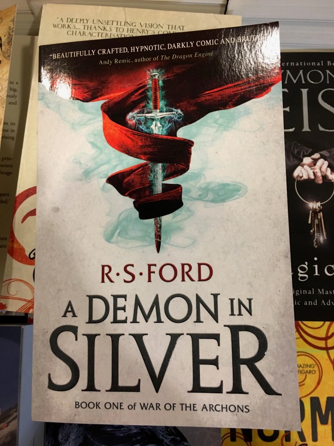
A DEMON IN SILVER
Design by http://cameroncorneliusdesign.com/
Who doesn’t love a glowing sword (that’s got tangled in some curtains)?! Again, this really caught my eye, though it maybe a little too YA for my book
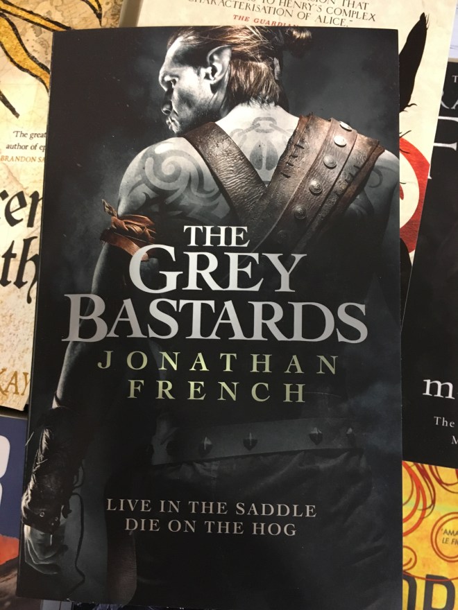
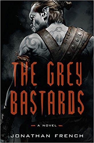
THE GREY BASTARDS
Cover illustration by http://rostant.com/illustration/
Design by Duncan Spilling https://uk.linkedin.com/in/duncan-spilling-39a0a05
Ooh, he looks mean… and a bit pale and peaky. Oh no, wait. He’s an orc! Excellent. It’s a little too moody for my book and feels more of a US cover than a UK one though not too American for Waterstones, clearly…
Here’s the US cover for the curious…
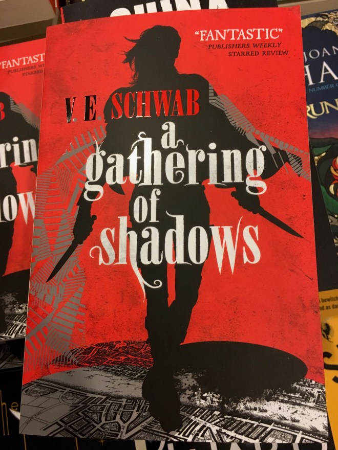
A GATHERING OF SHADOWS
Design by https://twitter.com/julialloydJLD
There’s lots to like here: The placing of the author’s name and title could have been a right old mess, but it really works here along with the review “Fantastic”, which is exactly what you want for a fantasy book! I want to avoid swords and daggers on the cover of my book (there’s a fair amount of swordplay, but it’s not that kind of book), but I loved the combination of red, black and white.
NEVERNIGHT
Design by https://twitter.com/ccbookdesign?lang=en
Illustration by https://kerbyrosanes.com/
Same series/author/illustrator as Godsgrave, but I can’t resist that black on white styling. Looks great on the table and we all love birds, birds, birds on the cover…
… okay, maybe there are too many at the moment. Maybe lay off the birds for the time being? My book has a few messenger pigeons, but not crows or ravens… Hey, maybe fantasy pigeons will be the next big trend? … No, maybe not…

THE CORE
Bloody hell! The stuff of nightmares looking straight at you on this one.
Another illustration from http://rostant.com/illustration/ though this was based on a “Demon model” by http://millenniumfx.co.uk/ who make models for Hollywood movies.
I bet that wasn’t cheap!

ASSASSIN’S FATE
Design: http://www.dominicforbes.co.uk/
Illustration: http://www.jackiemorris.co.uk/blog/cover-story/
Calligraphy: http://www.stephenraw.com/
Much more like it, but all those specials like gold foil cost a lot of money – only the big brand authors get that kind of treatment – and they credit a calligrapher! Pricey and most likely way out of my budget…

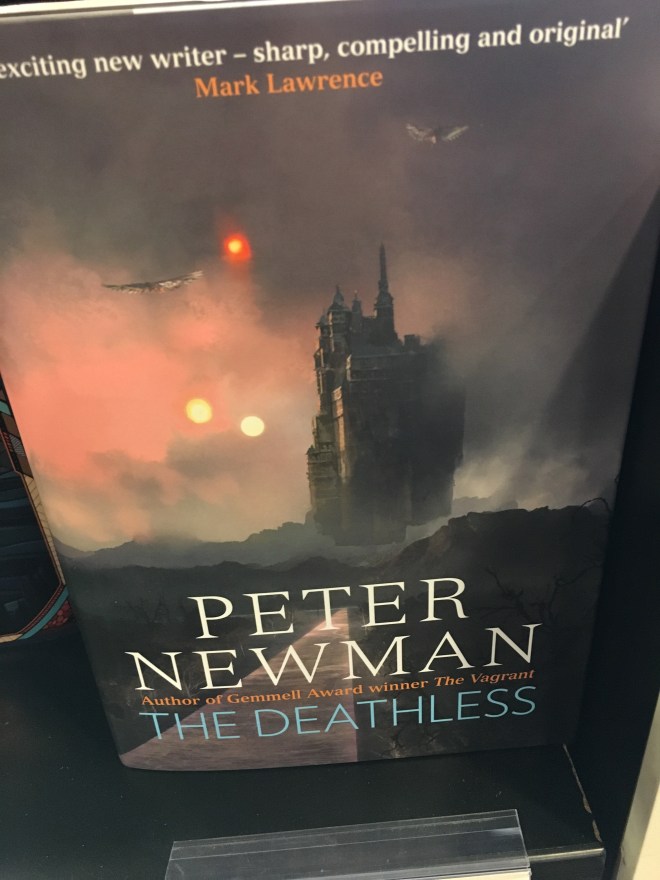
THE DEATHLESS
Design: http://www.dominicforbes.co.uk/
Illustration: https://www.artpad.org/
Striking in its simplicity and memorable. I keep noticing it in stores and online. Too sombre in tone for my book, but great cover art with a sense of epic scale.
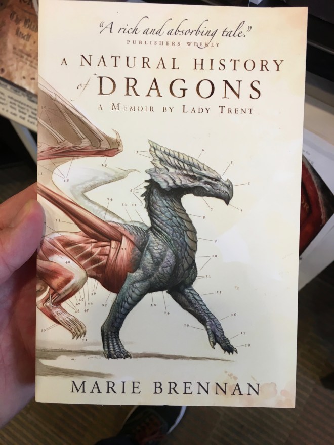
A NATURAL HISTORY OF DRAGONS
Illustration: https://www.toddlockwood.com/
I really like the tone of this one. A classic case of I would buy this book just on the basis of the cover… and we all want a cover like that, don’t we? And the diagram points make it feel like a book that may exist in the world of its own fiction. I have griffins and wyverns in my book, but they’re not as central to my story as they are here.
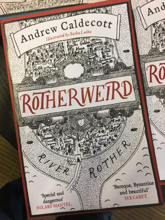
ROTHERWEIRD
Design: http://www.leonickolls.co.uk/
Illustrations: http://www.sashalaika.com/
I’m getting a Rivers of London meets The Witchfinder General vibe from this, and a great sense of location. It’s not quite right for my book, but I’m filing it away for another project.
LADY OF MAGICK
Design: Christina Griffiths http://www.bookdeluxe.net/section216431.html
Ooh, a book with the word ‘Magick’ on the cover (albeit spelled differently). Emily picked this one out. It may be a bit too YA for me, and there’s another bloody bird on the cover, but this is simple and striking and not the usual swords and dagger stuff.

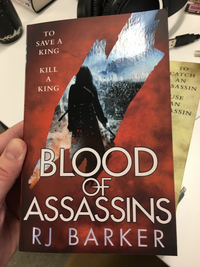
BLOOD OF ASSASSINS
Design and images: https://the-parish.com/
I like this a lot and yes that’s the author RJ Barker on the cover! (I’ve since learned that this is a lie, but I’m going to leave it here to show the world that RJ Barker is a great big fibber!)
Again, a bit too moody for mine but I really like the design.
Conclusions…
I’m thinking something bright and clear with a lightness of tone. Maybe a cross between Godsgrave and A Gathering of Shadows. A lapis moon plays an important role in the story, so I like the combination of blue on white, but I also really love the dragon on the Marie Brennan… Maybe I should just shoehorn a ton of dragons in….? Gah!! So much to think about.
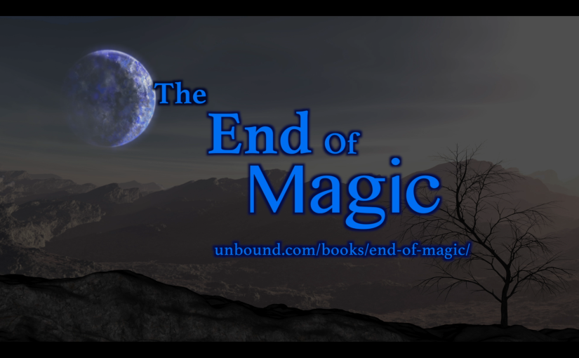
However, fancy-schmancy covers don’t just design themselves and to get something amazing will require a budget, so if you want to help me top-up please pre-order The End of Magic here.
Of course, there are plenty more books out there by amazing designers. Which are your favourites? Let me know below…
For regular writing tips, news and other stuff to help a writer get through the day, sign-up to my monthly newsletter, and grab a FREE eBook while you’re at it!